Case 1: Design
A Domestic Scene
A special occasion. Numerous women gathered from nearby farms and townships to attend an Extension School. This one has two goals: through the doorway past the curtain, Miss Ranney leads women across multiple generations in a sewing lesson; while up front in the parlor, another extension agent uses what they’ve learned from Professors Beulah Blackmoreand Annette Warner to teach the principles of dress design. The home economist has hung a black curtain across the wall as a backdrop to focus participant’s attention on the details of the garments they are about to consider. Extension agents often used black curtains to strip domestic settings of their local context. The curtain welcomes participants into a new managerial realm of comparable, typical, and well-articulated bodies and garments. With the ability to make any space look the same by blotting it out, these black curtains created an abstract space that remained the same whether in a rural home, the home economics building at Cornell, or the illustrations, bulletins, and lesson plans that moved back and forth between these locations. In these home demonstrations, extension agents were speaking not about personal preferences but universal design principles.
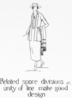
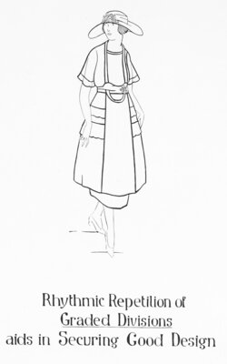
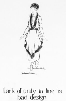
The four dresses highlighted in the center of the case (B, C, D, E) appear in front of a selection of Blackmore’s teaching aids which have been pinned to the curtain. Each card includes a drawing that illustrates a design principle. By studying these principles, the participant can compare each garment and attempt to determine which is “good” and which is “bad” design. This lesson in recognizing and applying design principles to judge the value of a dress provides the viewer with the opportunity not only to learn what home economists argued was “good” or “bad” in early twentieth century apparel design, but also to imagine what one could have said in a public setting like this parlor to demonstrate expertise and claim professional status. However, as Annette Warner pointed out repeatedly in her 1926 Bulletin on Artistry in Dress, the rules of good design are seldom infallible (28). Like the gummed-tape dress forms discussed in Case 3, dress design must navigate the individual specificity of the wearer’s body and complexion, their personality, and the occasion in order to arrive at an appropriate and well-designed garment. The principles of good design are universal, but their application is specific.
Four Examples
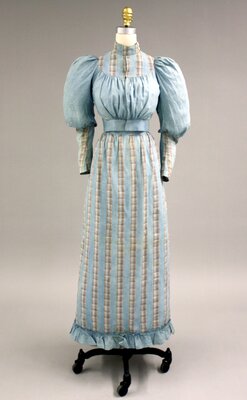
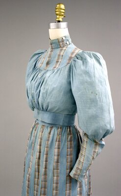
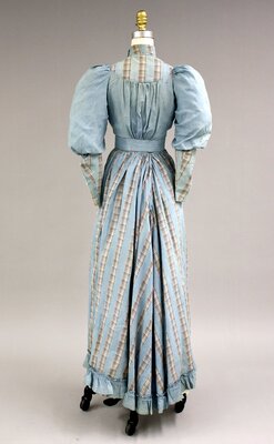
Starting from the left, Dress B is a blue plaid two-piece cotton dress worn by Mary Winifred Huntley in 1898. Clearly divided into upper and lower portions at the waist, this dress emphasizes the length of the lower half of the body while using the lines and scale of the bust, shoulders, and sleeves to focus attention on the yoke and high neckline that features two pearled buttons. Just above, design card number 9 argues, “Proportion or Space Division Makes good or bad Design.” Mary Huntley’s dress may be somewhat old-fashioned by this point in the 1910s, but the proportions appear sound: following Warner, the design follows the “natural” divisions of body, relies on natural points of support at the waist and shoulders, and it accentuates to the joints of the body at the elbows and shoulders. But would the dress continue to appear in “good” proportion if Huntley were over six or under five feet tall? “It should be reiterated,” Warner insisted, “that it is the proportionate, not the actual length of the waist that matters” (26). Were Huntley over six feet tall with a high waist like this, she would most certainly look out of proportion, which would in turn make this bad design for the wearer.
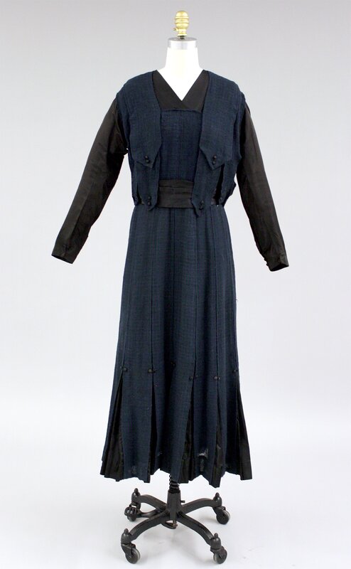
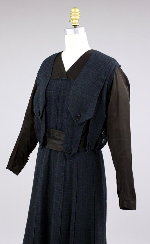
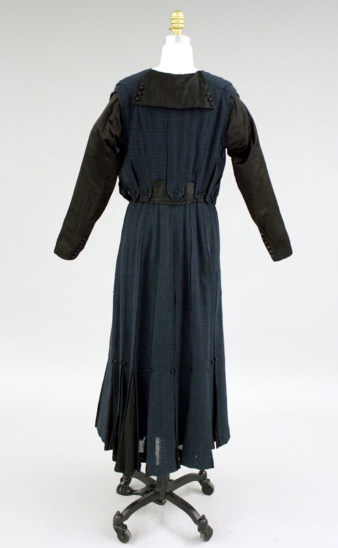
Dress C is a blue check wool dress with black silk inserts, decorative covered buttons, and sleeves from around 1911–1919. Along with what Warner terms the “natural divisions” of the body, dress design draws upon artificial divisions of space to alter a wearer’s apparent proportions and sometimes to create rhythms. Design cards number 11 (to the left of this dress) and numbers 10 and 13 (both to the right) present aspects of these principles in the effort to secure good design. “Rhythm in design, like rhythm in music or poetry, may be produced by a measured difference in sequence” (29). The box pleats around the bottom of Dress C, however, produce a series of vertical lines repeating one note. Above the vertical lines created by these pleats, two overlapping straps that extend over the shoulders and down to the waist are of similar width to the pleats below. And while the space between these two straps also has a slight variation in size, even these echo the width of the arms to either side. This demonstrates what Warner terms a “mechanical” division of space that is too equal to be interesting for while they are easily compared with one another, the differences between them are too little to engage the mind (28). The choice of material may further indicate that this dress is “bad” design, in part for the tactile difference between shiny silk and dull, rough textured wool. Moreover, the added complication in line and angle of matching large plaids across a garment presents such a complication “as to disqualify them for serious consideration in the costume of grown-ups” (45).
However, depending upon the occasion in which this dress was made, one might reach a different conclusion. Showcasing the re-use of fabric during a period of rationing leading through WWI, it is much easier to understand if not applaud the inventive use of black silk inserts and rough textured wool. Silk covers the arms and neckline holding the wool away from exposed skin on the top and expanding the shape of the dress around the feet to keep the garment from hindering one while walking. Perhaps the silk-wrapped buttons employed as accents throughout the garment are also re-purposed from a garment found in the designer’s own attic. Dress C has the quality of a design experiment and perhaps even a student’s design project for a class at Cornell. If a dress-design classroom during WWI was the occasion for making this dress, it might lead us toward a different judgement of its value.
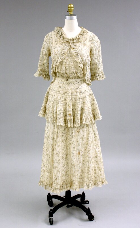
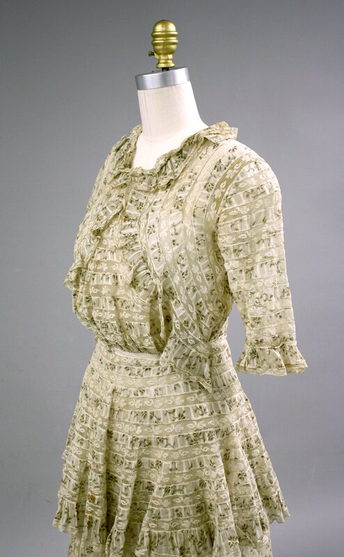
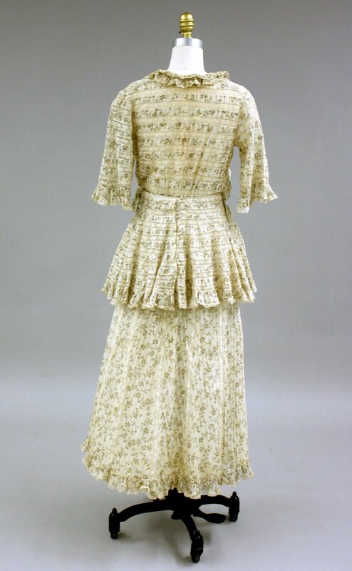
Dress D is a one-piece cotton dress of stiped fabric with a subtle printed pattern trimmed extensively in ruffles, dated 1911-1919. With the two tiers of ruffle trim draping from the neckline to the waist and the mid-thigh skirt tier overlaid on a longer layer, Dress D relates to the prior discussion of pattern and rhythm but raises a more important question of line and unity. Design card number 16 indicates that a “lack of unity of line is bad design.” Warner explains that “lines in clothing are made by the edges or folds in a garment, the seams in its construction, trimmings applied to the garment, and by stripes in pattern” (32). Unlike the many notable paintings Warner references, no full costume appears to be composed of all striped materials leading her to conclude that “stiped materials are not the first choice of artists.” Dress D makes use of all five different types of line that Warner discusses: straight, curved, broken, expressive, and oblique (32-37). While “straight lines” are said to emphasize force, formality, and possibly primness or severity, the ruffled edge around both the bottom and mid-thigh create “expressive lines” said to suggest “fitness to personality” and hopefully “an outward manifestation of inward grace” (36). The larger lines made by fabric layers that would have divided the dress into a series of balanced spaces are blurred by the smaller lines in the pattern and the waving lines of the ruffled edges.
While it lacks clarity of line throughout the design, this dress demonstrates a clear overall sense of unity. Unity is the central component of any well-designed dress. “A well-designed dress is so becoming to the wearer and so appropriate to her circumstances and environment that it is the woman herself that is noted and remembered and not her clothing,” writes Warner (49). And most importantly, a dress well-designed “for home, street, or any place should appear to be a unit or a complete whole” (51). Warner carefully notes those characteristics that create or detract from a garment’s appearance of completeness—that is, its unity. Dress D by no means checks every box that contributes to overall unity; however, the blurry lines and overt playfulness may well make it the perfect garment for the right personality. Warner insists to her readers that it is not simply that a businesswoman should wear business attire, for a woman with a fair and delicate face may look absurd in the crisp vertical lines of a business suit. And likewise, the austere face of a businesswoman with the right kind of charm and ruffled edge may be far more becoming to the wearer than any sharp-lined, linen coat.
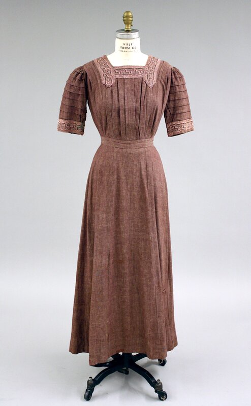
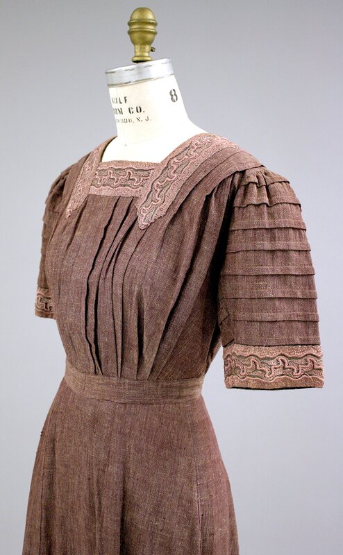
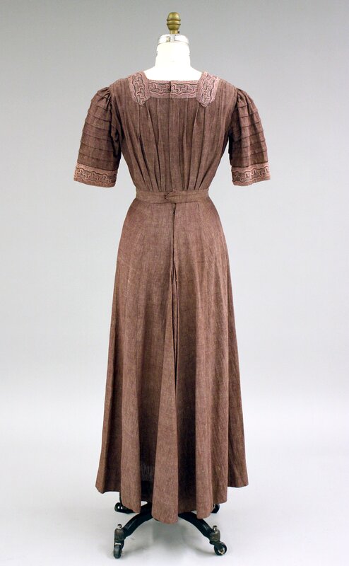
Dress E is a rose-colored linen day dress with horizontally pleated short sleeves, vertically pleated bodice, and an embroidered square neckline that dates to the first decade of the 20th century. In comparison to the preceding three dresses, this day dress seems marked by an almost Classical simplicity. The subtle vertical lines from the draped material below extend past the belted waist in a series of tight pleats curving around the bodice and emphasized by the heavy, durable material. Culminating at the neckline with embroidered panels framing the wearer’s face, this garment creates the impression of a Grecian column in rose-colored light. “Emphasis in dress design, like emphasis in reading or speaking, is more forceful when used sparingly and in the right places” (52). Ensuring once again that dress design focus design principles on the individual wearer, Warner continues: “The head and neck create the natural center of interest for costume design; to this center of interest should therefore be related the most telling areas, the most forceful colors” (52). What would be the personality of the woman wearing a dress like this and where would it be most appropriate to wear?
Bringing us back to the discussion of proportion with Dress B and design card number 9, these classical references underline an important idea: while good dress design is absolutely contingent on the wearer and the circumstance, and while no general design rule is infallible, the overall aim of “good design” remains singular, universal, and (at least when it comes to Annette Warner) well-known. As figure 6 from Warner’s book clearly points out, “proportion has no relation to size,” and while achieving good proportions has many sometimes-conflicting strategies, the ultimate goal was set in stone a long time ago.
A Tasteful Occasion
On either side of the previous four dresses the home economist’s black curtain falls away. Dresses A and F are situated in local circumstances raising questions about how to interpret them. Warner’s repeated emphasis on the need to evaluate each garment not only for the individual wearer, but for each occasion and location, makes proportion, line, or “unity” less applicable criteria than before. Are universal design principles like “unity of line,” “subordination to a center of interest,” or any of the other stipulations in Blackmore’s design cards still useful when considered inside an early twentieth century parlor? Unfortunately, both Warner and Blackmore remain silent on the issue—at least so far as I know at the moment.
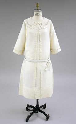
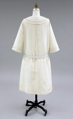
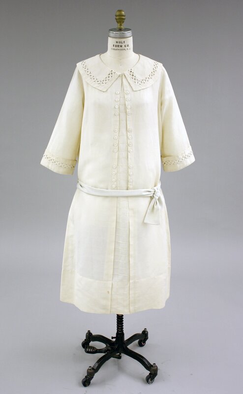
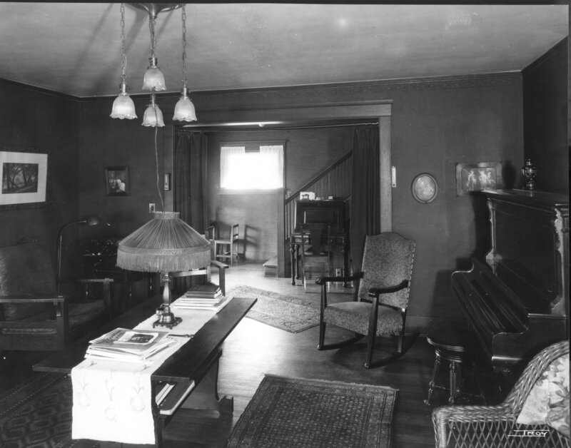
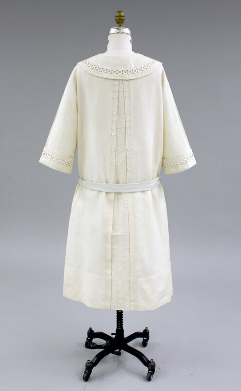
Dress F is a white linen dress (1920-24) seen in the parlor of the Ward house in Ithaca around 1926. Even though the round collar and cuffs feature inserted bands of embroidered rings from the early 1920s, I think it is safe to say that the overall look of the garment did not lose interest in the time since. And, that its appearance in the parlor of the Ward house seems fitting. Like the heavy wood furniture, clear spans of painted plaster, and general lack of pattern, this tunic-like dress is best appreciated in the smaller details. The front and back of the dress are anchored by a central, wedge-shaped panel composed by a square grid of neatly stitched tucks. Decorative buttons line the edges of the panels front and back, but the buttons are the same color as the linen and require some raking light for them to be seen from across the room.
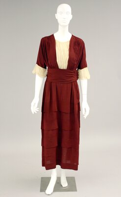
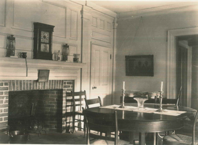
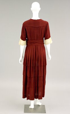
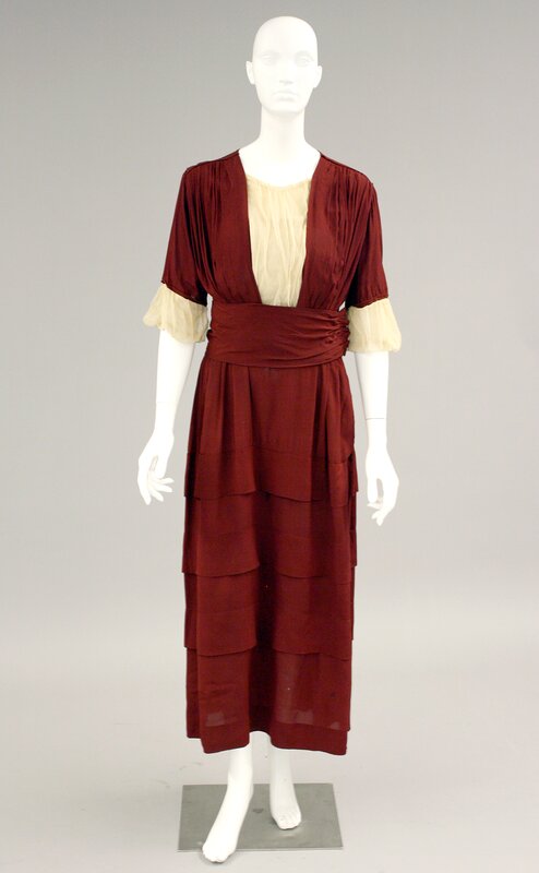
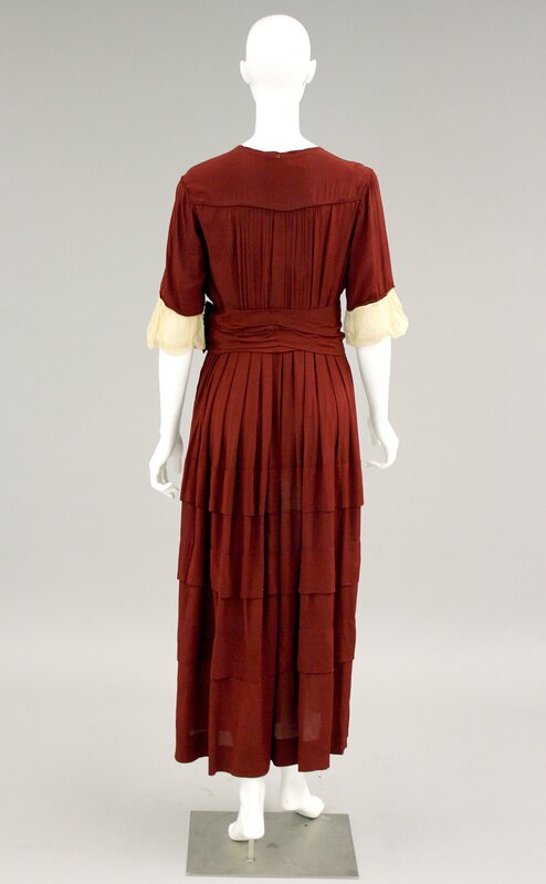
On the far side of the case past the black curtain, Dress A is a one-piece, wine colored silk crepe tiered dress with short sleeves and creme cuffs. Behind it the more delicate wooden chairs with reed seats stand near a wood-paneled wall and old fireplace. The Thomas Ellison house was first built in the early 1700s and has been remodeled or expanded numerous times since. This interior photograph is from the late 1920s and was likely taken by a Cornell architecture student. That student could have been a woman wearing this dress (though it is unlikely). The pleating at the top of the dress has a creme mesh insert and pleats that make three nearly vertical bands and are cut off at the waist by a wide wine-colored belt that is only slightly asymmetrical. It draws your eye to the gathered material under the left arm of the mannequin at the hip. In a series of tiers, the lower half of the dress expresses subtle horizontal bands—Hestia like, perhaps, in Warner’s opinion (23).
However, attempting to determine whether or not Dress F or Dress A are “good” or “bad” design while in these contexts begs for more information. We have a location, and we know that home economists are leading a demonstration in the next room, but what else do we need to know? Does the woman who wears Dress A have a job and would that make a difference for her dress? Is she hosting the event or a guest, and how far has she traveled to be here? Should there be a relationship between the dress and the room that gives some critical insight into whether the dress is “good” or “bad”?
More so than the evaluation of an individual dress out of context, determining which of these questions matter or which questions might be more appropriate seems to require an expertise I lack. Warner, however, does have something to say to her readers about how to cultivate good taste, a form of expertise central to all design professions. For Warner, good taste in line, material, and overall design strategy “is bound to grow thru the constant practice in making choices with some standard in mind” (10). To develop one’s sense of color, Warner recommends the following:
Continual thoughtful observation of color effects in nature, in the changing colors of the sky, the landscape, and the seasons, the effects of light and shadow, the exquisite colorings of birds, flowers, and insects; the collection of bits of charming color in fabrics; the gathering together of color schemes such as are afforded by the illustrations in current magazines and even in some of the advertisements; a study of the collections in art museums and natural-history museums and libraries, whenever possible; all will help to develop a power to see and to feel color that will inevitably lead to a more tasteful use of color in clothing (Warner 1926: 10)
Experience, in other words, will “inevitably lead” to better judgement. And so, to answer my questions above and to better interpret dress designs inside specific spaces, I need to spend more time there, to draw from visual culture and museums, to see the world as a resource. For Warren, experience with any topic will lead to a certain commonsense (Stoler 2008) and a definite comfort (Ahmed 2010; 2017) within parlors like these. Taste and a skillful eye will allow one to determine the “good” from the “bad” in any room so long as one keeps the right standards in mind.
